The Crossroads Carnegie Art Center’s Open Regional Show had a twist.
The Show was titled “Step Out of Your Comfort Zone.” They were encouraging artists to make art in a new way; to experiment with a technique never used before. Since I’m a mixed-media artist, I wanted to try something that could incorporate a variety of materials, and also to try something I hoped no one else would do.
When I received the show email, I instantly thought of printmaking. I thought about trying block printing or working with photography in a way that was more involved than point and shoot. I researched materials for both block printing and cyanotype printing. I chose to use solar printing papers because I needed to purchase fewer materials to get started. I also thought I could crossover my mixed media techniques in a new way with this method. Hopefully, people would still be able to identify my ideas in this new medium.
Solar printing is a process of developing images without the need for a darkroom or harsh chemicals. The results are ghostly and tonal. A mostly sunny day is all you need.
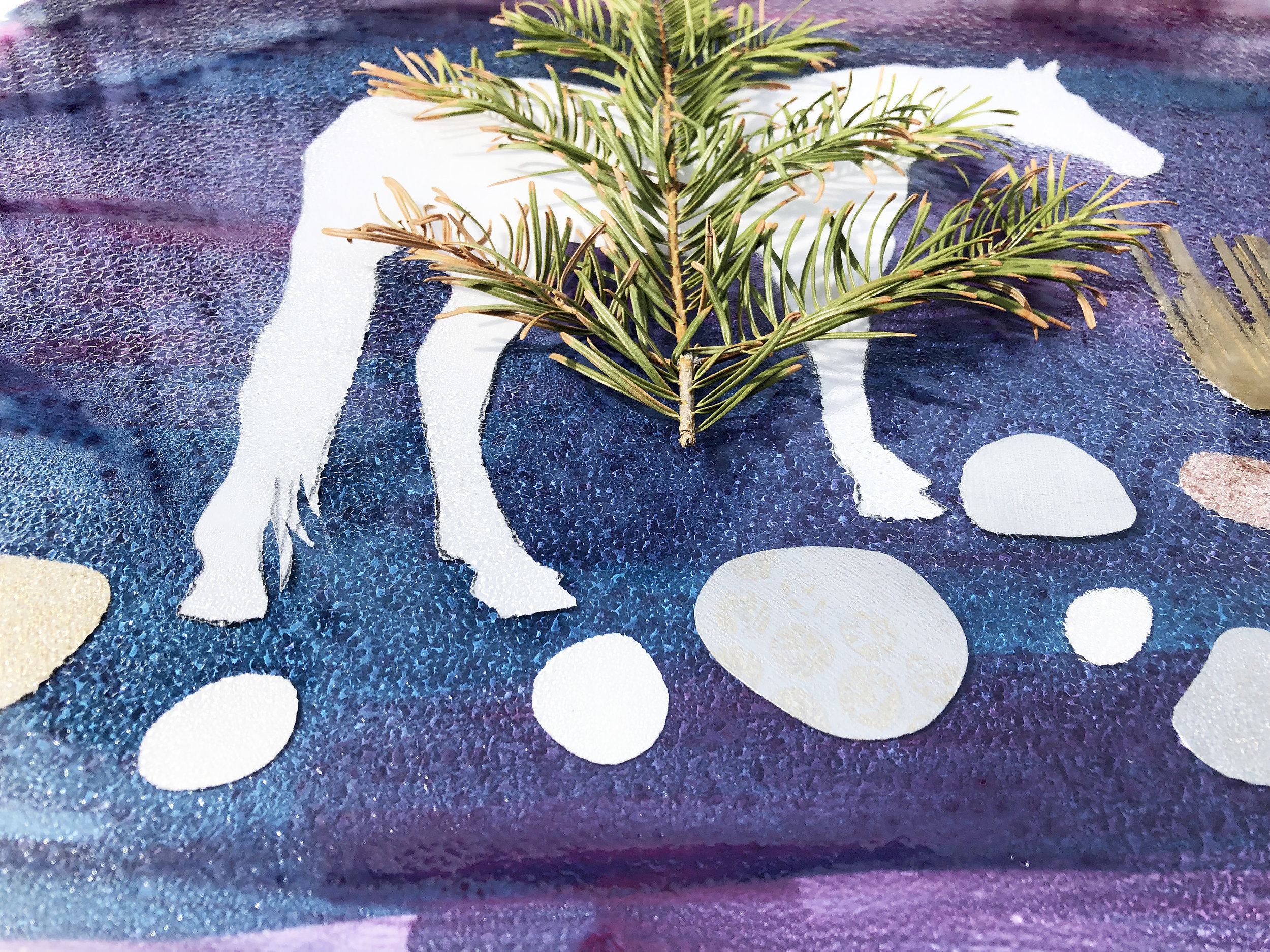
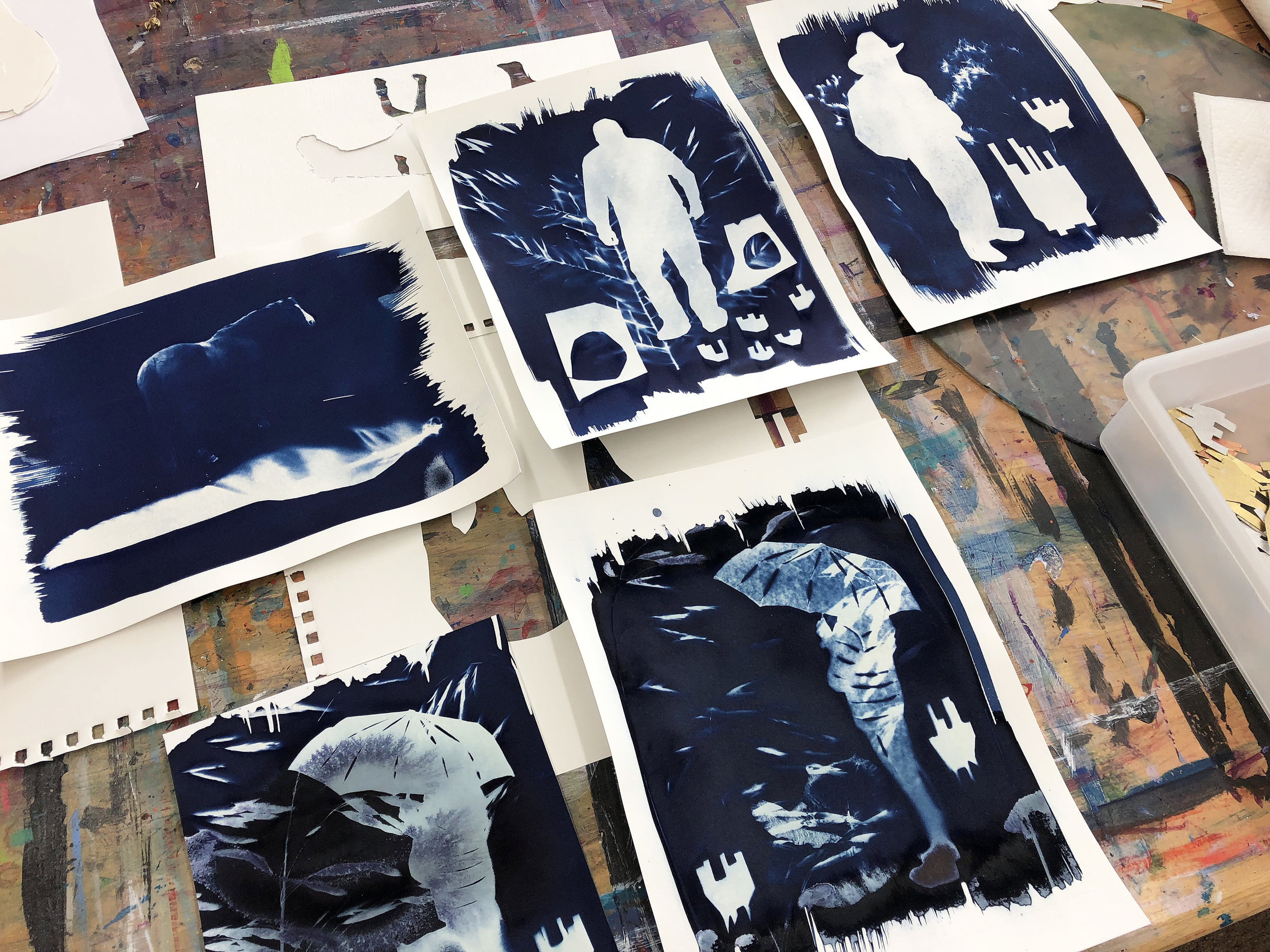
I first spent time experimenting with pre-made light-sensitive paper sheets. I collected organic materials from the mountains where I live. I found leaves, grasses, seed pods, pine boughs, turkey feathers, and dried sticks. I also delved into my collection of saved collage pieces, featuring rocks, stumps, and grasses that I have hand-cut to represent these natural elements in my paintings. While trying things out, the thickness of the paper I was printing on made a difference in the aftereffects.

Peter the cat

In process
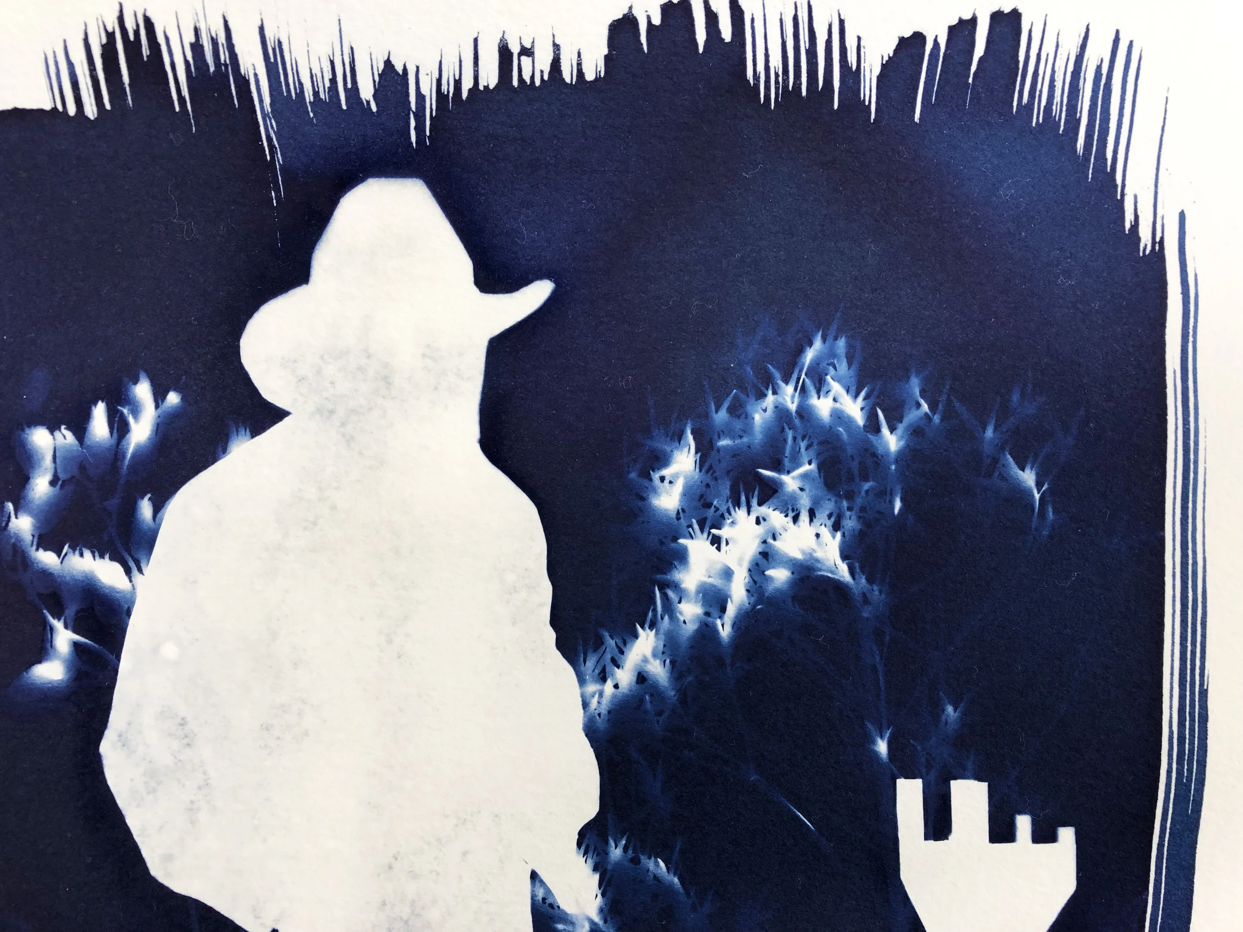
When I was ready to move on from practice sheets, I used two formulas that, when mixed, create the cyanotype sensitizer. This is the exact same formula that was used when the process was first developed by Sir John Herschel in 1842, 177 years ago. This mixture is applied to paper with a paintbrush. And a little goes a long way! It doesn’t have the prettiest color when first applied, but after exposure to the sun, it changes to a perfect deep Prussian blue.

Process
Pretty blue
I also tried mixing different colors of pre-made light-sensitive dyes. I was excited about them because they came in different colors other than blue. The dyes were thick in consistency, like gel, and didn’t mix in visible brushstrokes, as I had hoped. These dyes are developed while wet, which I didn’t like too much either. My paper pieces stuck and were hard to move around quickly for a good composition. The dyed paper also stuck to the glass top of my homemade contact printer, leaving behind processed dye colors. Washing the paper after exposure was more involved, making the paper I had printed on easy to tear and flake.
Pine
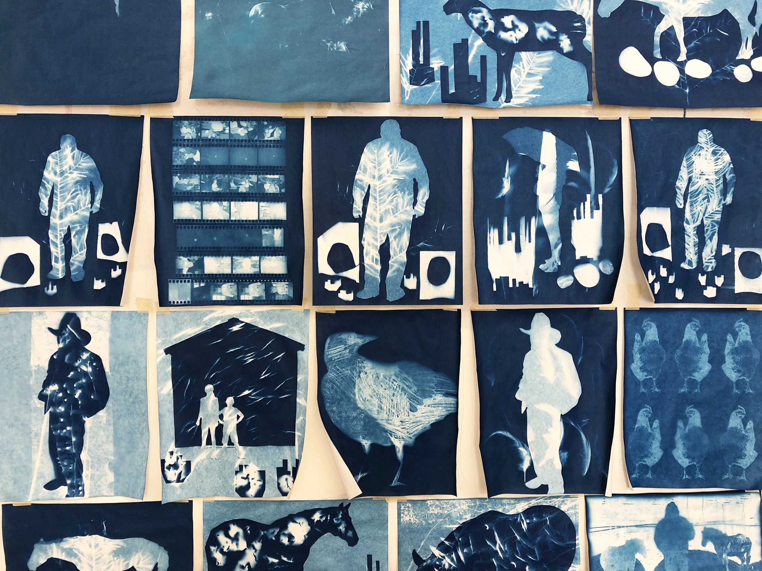
I returned to the original cyanotype process formula and produced additional prints. I printed on watercolor papers and oil/acrylic papers. My subjects were animals, people, and flowers. I combined printed digital images from my photography, found organic materials, and cut paper collage pieces to mix film negatives with photograms.
Many practice sheets

Negative
There was a lot of trial and error, as everything depended on the layer of dye applied to the paper and how well sunlight could penetrate the different materials I set on top.
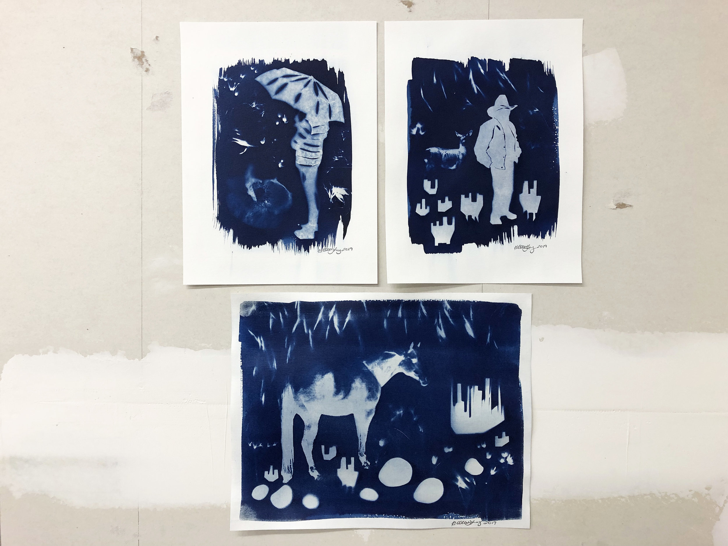
Finished pieces
After experimenting more with the process, I have a good sense of how the dyes behave.
To see more of my cyanotype work, visit my Etsy shop.


A series about exploring plus an art show